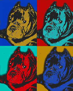
Album cover
1) the best thing about this project was the color i inserted in the drawings because it brings out the art
2) the weakest thing about this art was using mostly red and yellow (mostly) because i feel like i could've added more
3) a way to improve this would be to add more color on the art
4) the tools i used to make this was a magic pencil tool, gradient tool, and a pencil tool
5) i was able to reach my goal because of how i add the drawings and being to use the magic tool to to separate them
6) the easy part of the art was to just copy and paste the photo drawings because all i had to do was to just paste to where i wanted to put the photo.
7) the difficult part of this art was trying to delete the photo while trying to keep the outline stay
8) if i was to do this assignment again, i would change some of the art or to add more art
9) if i was to scale the work that was put in this art i would give it a 7 out of 10 because of how the coloring was kin-dove difficult but i could've added at least on more photo


You need to do WAY more to this. You didn't incorporate text, brush, or opacity. There are not 13 objects. Try overlapping images. Play with your composition more. Asymmetry is key.
ReplyDeleteyour album cover is really nice and love the design and the theme only thing is if the shadows popped out a little more
ReplyDelete